The US 'midterm' elections have finally started to wind down, and we finally have some (mostly) finalized results to study. But what's the best way to visualize who won the US congressional seats in each of the 435 districts? Let's dive into this topic!...
Preparation
For starters, I couldn't find a convenient data source for the election results. All of the ones I could find were either for a single state, or they had some sort of GUI interface to view the data ... but no text csv files or spreadsheets to download, or even a simple HTML table. So I did a lot of copy-n-pasting and built my own spreadsheet, and then used Proc Import to import it into SAS.
Once the data was in SAS format, I wanted to plot it on a map. But I couldn't use just any map (such as the US county map), because this data was by congressional districts. The borders of these congressional districts get re-drawn every 10 years when we have a census, and sometimes more often than that. After a bit of searching, I found that I could download a shapefile of the polygons from the data.gov website. The most recent map I could find was the 115th congressional districts, so I downloaded that shapefile, and imported into SAS with Proc MapImport.
Traditional Map
Here's my first attempt at plotting the election results on a map. Click the image below to see the full-size version, with HTML mouse-over text. I colored the congressional districts based on the party of the winner, and outlined the states in white, to make the geography more easily recognizable. I also outlined the districts that had 'flipped' (changed party) in black. [You might also notice a few yellow districts in the map - these were named 'ZZ' in the shapefile, rather than a valid district number.]
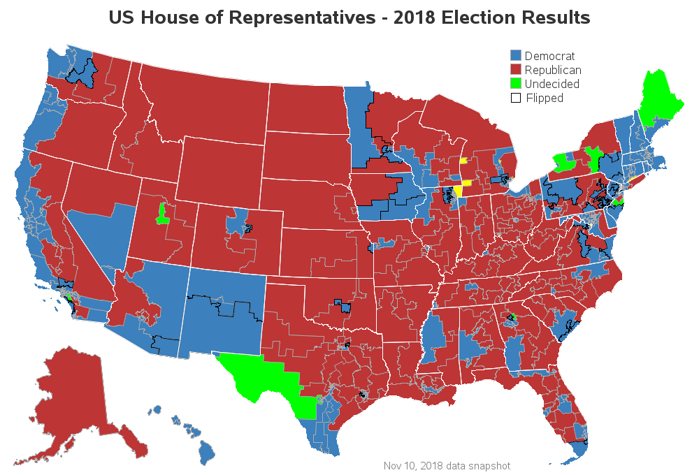
By design, each of the congressional districts has approximately the same number of people, and therefore the districts including large cities where people are densely packed are geographically very small ... which makes them difficult to see in a traditional map like the one above.
Cartogram Map
Although it's interesting to see the election results plotted on a traditional map, perhaps it would be more useful to visualize the data using an equal size area for each of the districts. A few years ago, funky cartogram maps became all the rage - stretching and contorting the maps such that the areas of the polygons were proportional to the data being plotted. Here's an example of such a cartogram map of the 2010 midterm election results:
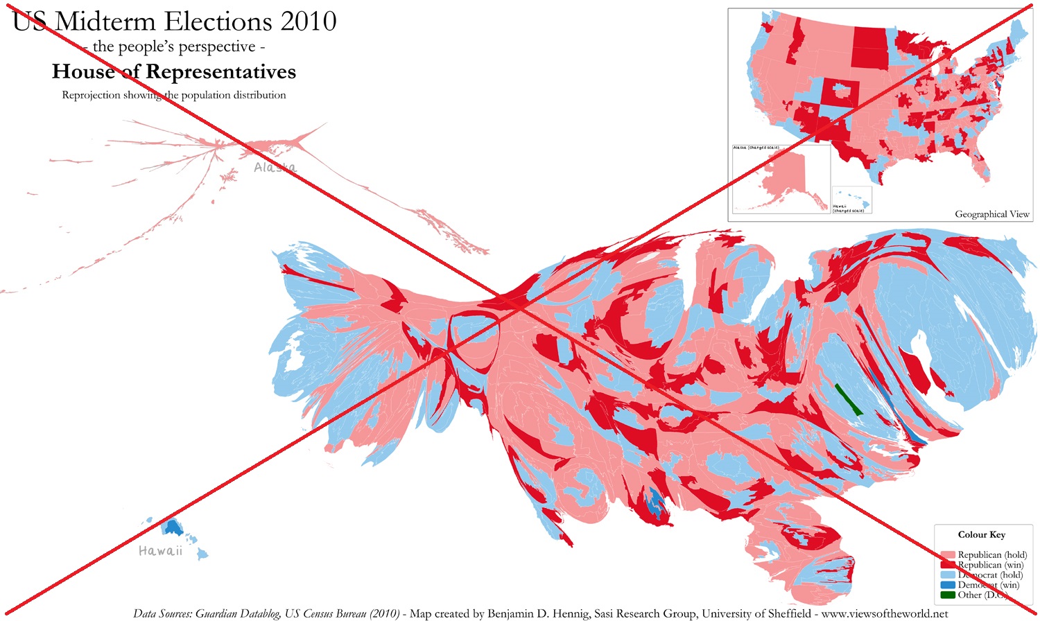
As you probably notice, the areas in the map are not recognizable (in shape or position), and it's difficult to compare the areas since they have varying shapes. This type of cartogram is what I consider a 'bad map' - I see no redeeming qualities in this type of cartogram whatsoever. Thankfully, funky cartogram maps have fallen out of favor, and you don't see many people publishing maps like the one above anymore.
But there are cartogram maps that do help provide more insight into the data. With this data, each congressional district has one representative, and creating a cartogram where each district is exactly the same size, and also the same shape (such as a simple square), provides insight into the data. The difficult part is arranging the squares such that they form recognizable areas in the map. Here's a map I saw on Twitter that does a fairly good job (it's a screen capture credited to @nytimes):
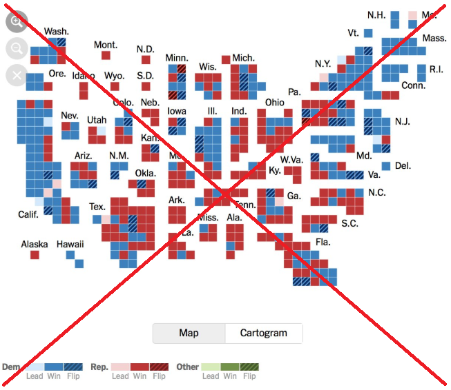
They did a decent job of arranging the squares such that the states are in somewhat recognizable shapes, and somewhat correct relative positions (the labels help, of course!) I also liked that they had a button to switch between the cartogram and the regular map (of course, this feature doesn't work in the screen-capture on Twitter). But I thought the map had too many colors/patterns - there were 9 colors/patterns identified in the legend, and that was just too many for my brain to keep track of.
Therefore I set out to create my own new/improved version of the cartogram. In my version, I decided to use just 3 colors - Democrat, Republican, and Undecided. And I simply draw a black border around the districts that flipped (changed party). I also shortened down the labels to the standard 2-character state abbreviations, and added a title and footnote.
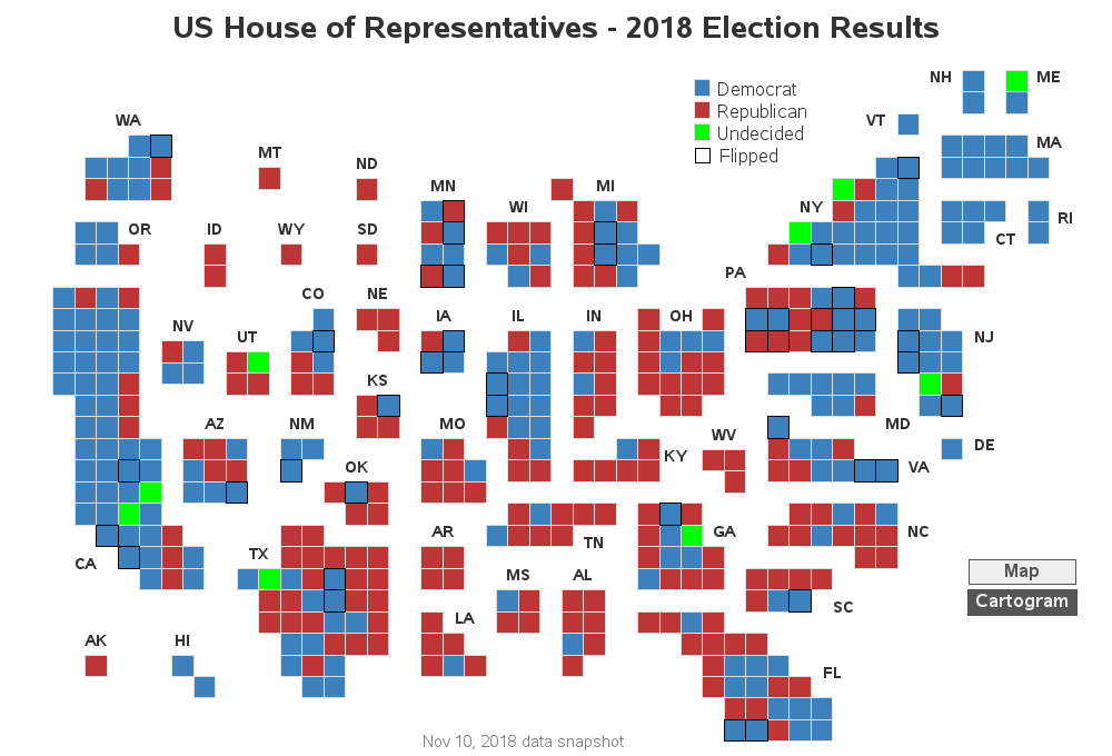
Note that I annotated some buttons at the bottom/right to toggle between the traditional map and the cartogram. I think it's great to see the data plotted both ways, to get a better understanding!

Click the images above to see the full-size interactive maps, with HTML mouse-over text, and the buttons to toggle between the versions.
Are you saying "Wow! - I didn't know SAS could do that!"? If you're curious about the details, here's a link to my SAS code.


11 Comments
I’ve been wanting this map! Thank you!
Is there a link I can click on that shows an updated version of this map as the remaining elections are resolved?
This is the best representation I've ever seen of congressional district voting results nationwide.
Great Job!
Hmm ... I might update this map (same link) when all the elections are resolved. But then again, from a programming learning/teaching experience, it might be more interesting to leave the unresolved elections in the map (to show how to handle them visually). If I decide to create an end-result map, I'll post another comment reply, so you'll know :)
What happened to Michigan in the traditional map?
That's how they made the shapefile for the districts (ie, they included the water). It's similar (but not as noticeable) for the North Carolina coast.
That's awesome! I always say when the regular map is used that dirt dont vote! The open rural areas need to be accounted for people not vast areas of dirt and rock.
Wondering if you are a related Allison. This seems like the sort of thing my relatives would love.
Perhaps! :)
Rob,
I think you have Utah labeled as Nevada in the cartogram. There are 2 "NV".
I like this cartogram better than the 'tiled' style I saw in the Economist a few weeks ago. "Exploding" the country helps put the states in better relative positions. Nice work!
Good catch - thanks! I've fixed it now!
(And note that this isn't a bug in the software, but rather user-error. To get the labels in the exact position I wanted them, I entered the text and x/y locations into a dataset manually, and put the wrong text in for Utah.)
Great way to present the data so the geographic size of a district becomes a non-factor in the display.